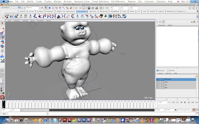
It is of a Monkey,
There are a lot of problems with the rig as the painting of the weights is all wrong, so when they are animated the geometry clashes together and it doesn't look very professional. If the weights were painted properly then I think that I could get better animation out of the two characters.

As you can see in the Pictures that the geometry is all wrong with the painting of the weights.
The Geometry is all twisted on the lower picture.
Also the Handles do not sit right when they are on 0 as they should be.

No comments:
Post a Comment